Class 1
10-23-2014
Goal: Welcome and learn what makes a website "good"
- Welcome
- Flipped Classroom - Flip teaching is a form of blended learning in which students learn new content online by watching video lectures, usually at home. What used to be homework (assigned problems) is now done in class with teachers offering more personalized guidance and interaction with students, instead of lecturing. Our lectures were provided by Artie Kuhn.
- About Kirk
- Syllabus
- Discuss web sites found during pre-assignment
- What's the goal of the website?
- What did you like?
- What could've been done better?
- What was just plain wrong with the site?
- What websites have you visited recently, and why?
- How does the goal of a website affect it's design?
- What did you notice in terms of color schemes, menuing systems, and overall feel of the site?
- Is the site multi-browser and multi-device compatible?
- How & when are they expecting the site to be used?
- Divide yourself up into groups of 3 or 4 for the On Your Own 2 research.
- Discussion from class
On Your Own 1
Techie stuff to do your work for this class
All assignments and projects for this class need to be submitted by putting the files in your Universal Disk Space (UDS) on a Miami server. To do that you will need to configure your web space (did you know that you have web space?). You can use NetDisk to set it up. Once you have your space setup, I will walk you through how to upload files. It's very important that you get this done before our next class. I want to use our class time to discuss other things.
I am using a Mac; if you're using Windows, go ahead and watch the videos to get an idea of the goals. There are several different flavors of Windows, each with their own nuances. You can always refer to IT Help for details on doing things in Windows.
If you're off campus and you want to work with your Universal Disk Space (UDS) you will need to use a VPN client. You do not need to do this from on campus. You only need to watch this next video (and setup a VPN client) if you plan to work from off campus.
As an alternative to the FTP option shown earlier, (on a Mac) click on the desktop (to bring Finder to the foreground)...Go...Connect to Server, then enter smb://it.muohio.edu/files/MyFiles/U/UNIQUEID where U is the first letter of your last name, and then your UniqueID. Mine is: smb://it.muohio.edu/files/MyFiles/H/HOPKINKS. Now you can use Finder to open and edit your web pages. Also note that while using muohio.edu still works, the university prefers that you use miamioh.edu now. Here's a tutorial on how do this for those of you who are more of a visual learner.
Understanding the needs of your user/customer
There are a variety of ways to get at the heart of this, but a great way to jump start it is leveraging the techniques developed by the internationally-famous design firm IDEO. They call their process the "Deep Dive".What is interactive design?
Design is how it works. Style is how it looks. This class will be about how to design and how to build interactions. Here's a look at designing.The Deep Dive and Interaction Design
IDEO Method Cards
Exercise: Your client is Honda. They want to make a new vehicle for retired people. They've found that they're simply not selling enough cars to them and want to know why. Which six of the Method Cards would you use to understand why? List the order that you would do the Method Cards (like "I'd start with the 5 Whys", then I'd do ...) and why each card. What would you hope to get out of each card?Project: Recipe Site
The Problem
College-aged people eat out too much. It’s expensive and not very healthy. You will develop a three page (minimum) website as a proof of concept for a new way to present recipes online. This proof of concept will be functioning HTML and CSS code that students wrote by hand. Before any design or any code is created, you will learn the full interaction design process as used by firms like IDEO, beginning with team-based research.Primary (Group) Research
So far, you have engaged in "Secondary Research", which are readings and studies that already exist. Now you'll engage in "Ethnographic Research" as a group. The goal is to find out why college students don't cook at home. You should end up with a big list of problems. As a group, determine which IDEO Method Cards your team should try to accomplish. Identify who will do which cards and in which order. It's okay if just one person does a card. It's okay if multiple people do the same card. It's okay if you find ways to collaborate. Once you've done your research, as a team synthesize the research and each person on the team will use the research to later build a unique persona (info on personas shown below).Assignment: Research for the Recipe Site (due Class 2 on 10-30-2014)
Personas
A persona is an imaginary caricature of specific demographics that share a common set of problems. For instance, a persona for home buyers might be first time home buyers. While their ages and income levels might vary greatly, they all share the same set of problems. They don't know exactly what to look for. They've never done this and they're very worried because their afraid they'll waste their money and look foolish. BUT, they also share a common set of opportunities. They don't need to sell their old home before they move so they're flexible on timeline.
There's a great book that we site in interaction design all the time called About Face by Alan Cooper. Cooper is very respected in the interaction design community. It's available for free if you search for it. You can connect to the Safari Books Online and read it for free (well, not for free! Your tuition is paying for this awesome service, but you get the idea).Creating personas - intro to Photoshop and Illustrator
There are a variety of ways to get at the heart of this, but a great way to jump start it is leveraging the techniques developed by the internationally-famous design firm IDEO. They call their process the "Deep Dive".Class 2
10-30-2014
Goal: Learn file management techniques and tools for building a website
- Review results of Assignment Do research for the Recipe Site
- Discuss IDEO Method Cards
- Learn
- Look
- Ask
- Try
- Discuss Personas
- Setup UDS for web content with IMS222 folder
- Web Development Recommendations
- Keep it manageable & maintable (stale and outdates sites are an embarrassment)
- static vs dynamic
- http vs https
- file space (where to put web pages), we're going to use Universal Disk Space (UDS) disk space
- Miami Specific: Knowledge Base / IT Help
- Video tutorial from On Your Own 3
- VPN (if off campus)
- WebDAV - https://webdav.netdisk.muohio.edu/
- SMB - smb://it.muohio.edu/files/MyFiles/H/HOPKINKS
- FTP - Cyberduck, Transmit, etc.
- file organization (folders and sub-folders)
- file (picture) sizes - KB vs Kb
- file types
- .htm
- .html
- .php
- .asp
- .cfm
- legalities - use your own stuff and know that you may need permission for some things (pictures/video)
- naming conventions (dates YYYYMMDD, no spaces)
- text editor (how to edit web pages)
- photo editor
General Info
- Different ways to edit web pages - review some websites that Kirk uses for website management
- Text editing: Personal site
- WordPress: Harrison Music Booster
- Elexio: Church
- Google: Band
- Facebook: Band
- Text editing: MyCard
On Your Own 2
Defining (limiting) the problem
Choose a subset of problems for your solution to attack. This solution will also be known as The Big Idea. Don't try to be all things to all people, figure out what's important (the big idea) and work on that. In Marketing you may hear, find a need and fill it or create a need. Many years ago I learned the KISS idea, Keep It Simple Stupid. A good philosophy in many respects.
Vote on what you think needs to be tackled. Each person get's the same number of votes (maybe 8). The items with the most votes are what you will use to create your persona.
I would like to drive home this point on simplicity and building something that does more by doing less.
The history of innovation is filled with examples of products that did less than the competition, but performed better over the long haul. Decades ago, radios were powered by large vacuum tubes. They were huge and, essentially, were furniture in living rooms. But, the sound quality was great. The transistor came along and radios could be made out of them instead. They were small. So small, in fact, that you could carry around one like we do smart phones. However, transistor radios sounded pretty terrible. No family would gather around in the living room and listen to a transistor radio. So, the existing radio manufacturers ignored the technology and kept going with the vacuum tubes. Japanese manufactures saw an opportunity and jumped on it, making small, low power, low cost pocket-sized radios. In America, they were a hit. Not with the previous customers (families), but with teenagers who could listen to music on the go. The transistor radio was a lower quality product. It stunk. But, it solved a new problem for a as-yet un-tapped customer. Over time, the technology improved and the companies who had invested in vacuum tubes went out of business while the ones that invested in transistors flourished (SONY for example).
Today, the iPad is doing the same thing to the laptop/desktop industry that the transistor did. It's a crappier machine than your average PC laptop and desktop. It can do less stuff. However, its simplicity, portability, delightful user interface and form factor solves problems the laptop/desktop was unable to solve and is selling like hot cakes and disrupting the laptop/desktop industry.
That's what our problems-to-solve exercise is about. Can we find new problems that potential customers are having that no one else seems to notice? The next few posts will be readings on why less is more in software design. Read the above link. What stood out to you? Do you buy the argument that for most consumers, the PC will be a relic?
Assignment: img/Persona.jpg (due Class 3 on 11-06-2014)
- Assignment details: You should have the following in your persona
- Persona Name
- Problems
- Goals
- Special Considerations
Save your persona as a jpg (to be uploaded to the web on our next class)
Less is more (Grab the low hanging fruit)
37 Signals is a company that exemplifies less is more. Their productivity web-based tools sell extremely well and all do much less than the competition. However, what they do do is just what most customers need done. Because they have a smaller toolkit, their products also make it much easier to get stuff done.
A handful of years ago they published their first book, _Getting Real_. In many ways, it's their manifesto. Read the following sections of it. What stands out to you? Do you agree with them? Should software be (in their words) opinionated? What's an example of software or website that you use that's opinionated? How so?
Why should you wireframe?
Web Style Guide
Fonts
Alright, you have the basics of type and color. Next we'll transition to actually using them. Before we do, however, you need to know a couple of technical constraints.
First, for color. All monitors are calibrated slightly different. Each monitor also has a different gamut (the range of available colors it can display; handhelds with high-end screens like iPhones display more colors than handhelds with lower quality screens). Each operating system also adjust colors in a slightly different way (Windows is pretty bad and tends to darken and over saturate colors). So, don't ever get too sold on a given color because almost all of your users will see a slightly different version than do you do. For folks used to designing for print (like graphic designers) this is infuriating. Sorry. Deal with it. There's really no reasonable way around this. Instead, get used to considering your colors relative to one another and get used to the fact that folks on Windows or lower-quality handhelds will not be able to see subtle variations in colors because their OS or hardware makes that impossible. If you've ever heard about "web-safe colors" or see a button in Photoshop or Illustrator to limit to "web-safe colors", you can ignore it. That advice is about 15 years old and is no longer relevant with computers newer than 15 years old. We've moved way beyond that, so ignore it and never turn it on.
Developing a good color palette is tough work. A great trick is to use the tool Kuler to pick a palette someone else has put together. The tool is available here and I encourage you to kick the tires a bit before we move on.
For typography, the limitations are a bit more heavy handed. In order for fonts to display on a computer, they must be installed on that computer. So, if you design with a font that isn't commonly installed on most machines in the world, it won't show up on your end user's machine, even if it looks okay to you. There are newer ways around this constraint, but we won't get to that until later in the course. For now, however, you need to constrain yourself to fonts that are common across most of the computer accessing the web. These are called "websafe fonts". As we start designing our mockups, consider color and typography carefully. Limit the typography you use to websafe fonts.
Class 3
11-06-2014
Goal: Learn some basic html
- Review results of Assignment Create a Persona for the Recipe Site
- Discuss wireframes
- Upload Assignment Create a Persona for the Recipe Site to https://www.users.miamioh.edu/UniqueID/IMS222/img/Persona.jpg
- Discuss files, tips, and tricks
- avoid using spaces in file names and folders
- create a LearningHTML.htm in your UDS ( https://kirkhopkins.com/IMS/IMS222/LearningHTML.htm )
- navigate to the page using a web browser
- General Editing & Testing Tips
- (substitute ctrl for command if you're on a Windows machine)
- command S to save a document
- command R to reload the page
- command F to find text on a page
- command X to cut text
- command C to copy text
- command V to paste text
- command A to select all
- command + to zoom in (sometimes)
- command - to zoom out (sometimes)
- command Q to quit the application
- command Z to undo the last action
- command N to create a new document or tab
- command T to create a new tab
- command tab to flip through programs
- command ~ to flip through windows in a web browser
- command shift arrow keys to flip through tabs
- command option U to see the source code
- In a text editor, showing the line numbers is helpful
- Using a text editor with color-coding is helpful
- Using 'column mode' with your text editor will save you time
- edit the test page to say hello world
- html (Hypertext Markup Language, a standardized system for tagging text files to achieve font, color, graphic, and hyperlink effects on World Wide Web pages) – standard tags
- bold
- italic
- breaks
- paragraphs
- table
Column 1 Column 2 Column 3 Row 1 Data 1 Data 2 Data 3 Row 2 Data 4 Data 5 Data 6 Row 3 Data 7 Data 8 Data 9 - ul & li's (un-numbered lists)
- List
- Item 01
- Item 02
- Item 03
- href to another site target="_blank"
- href to another page (same window)
- anchor on the page (points to the bottom of the page)
- images (gif, jpg, png)

- 'relativity' with links (i.e. pictures) img/KSH_logo.png vs /img/KSH_logo.png vs. ../img/KSH_logo.png etc.
- pdf's view a sample pdf
- embedded video
- embedded audio (no sample, never used it)
- dead link checker
- cookie crumbs (site navigation displayed)
- "Home" link - site wide or sublevel (i.e. a department page)
- Web forms, we won't cover these other than to know that they exist
- code formatting and indenting
- Redirects (two styles)
- Section 508 Compliance
- Complementary Color Schemes TigerColor.com - Paletton.com
- On a Mac, find the hex (hexidecimal) value of a color on the screen (like Classic Color Meter referenced in some of the videos)
- Apps...Utilities...DigitalColor Meter
- View...Display Values...as Hexidecimal
- To copy the color value -> Shift Command C
- Paste it in to your code
- border-radius.com
- margin->border->padding->text<-padding<-border-<-margin
- Things to avoid/other nuances
- "Click Here" if you want your web page to still be in the 90's
- marquee (sliding text or pictures)
- blink
- animated GIF's
- flash (doesn't work on iOS, thankfully)
- automatically playing audio/video on page load
- stretched photos
- designs that don't scale (i.e. not responsive)
- designs that are too busy
- UDS...save pictures on desktop, then move them to web space
- Tools
- Google search box
- Google analytics
On Your Own 3
Text Editors
Now, it's time to dive in and actually make something.
To do the next step, you'll need a text editor. Here are some that you might want to check out:
- TextWrangler (Mac)
- TextMate (Mac)
- Coda (Mac)
- Diet Coda (iOS)
- Notepad++ (Win)
All in all, what you want in this software is something that works for you and colors the code so you know if you're running astray. If any of you have done some of this stuff and want to share your favorite software with the class.<\p>
NOTE: DO NOT USE DREAMWEAVER. You'll notice I made that all in caps and in bold. If I could make it blink and in red, I would. Never, ever, ever, ever use Dreamweaver until you know what you're doing; and by then you won't want to use it. It's garbage software that mucks up the code and will cause loads of problems for you later. Sure, you can probably use it and I won't notice, but trust me, it's nothing but trouble.
Assignment: Recipe.htm (due Class 4 on 11-13-2014)
Create a simple HTML page that's a recipe. It needs to have a headline (h1), a subhead (h2), an introduction paragraph or two (p), a list of ingredients (ul) and a list of steps (ol). Save it to https://www.users.miamioh.edu/UniqueID/IMS222/Recipe.htm.
Class 4
11-13-2014
Goal: Practice Building Web Pages using HTML
- Review results of Assignment Create a web page
- Practice with HTML - Create https://www.users.miamioh.edu/UniqueID/IMS222/AnotherPage.htm
On Your Own 4
Now it's time to start implementing my mockup. Here's a lecture that walks you through that process. Follow along with this zip file if you like.
Class 5
11-20-2014
Goal: Use Responsive Design to Build a Web Page using CSS
- Practice with CSS - Create https://www.users.miamioh.edu/UniqueID/IMS222/ResponsivePage.htm
On Your Own 5
Assignment: FixThisSite.htm (due Class 7 on 12-04-2014)
Find a website that fails and tell what needs to be redesigned to fix it. You should have one page identifying the site and it's problems and a sample page showing how you would fix those problems. Submit your assignment as a web page(s) to your UDS at https://www.users.miamioh.edu/UniqueID/IMS222/FixThisSite.htm.
I created a sample for this project that you can use as a reference.
Sigh of relief?
The remainder of this course will mostly consist of using the information that you have gained thus far.
The History of Interaction Design

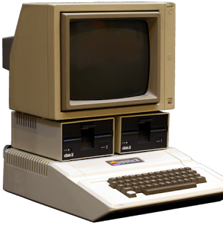
Let's turn to an expert. We haven't gotten into the history of interaction design all that much yet. But, Bruce "Tog" Tognazzini is one of the key early players in the evolution of interface design. In 1977, Apple introduced the first of the Apple II computers. The Apple II was a huge deal for a number of different reasons. Personal computers were just starting to emerge, but most were sold as components or in a kit that the end user had to literally assemble by hand. The Apple II was the first machine to be sold more like an appliance for regular home users to enjoy. It was almost an immediate success. By the end of the Apple II run, around 6 million Apple IIs had been sold, an unprecedented number of machines in the nascent personal computer industry.
Soon after the introduction of the Apple II, Steve Jobs saw some of Bruce Tognazzini work and had him hired onto the Apple II team. When Tognazzini began at Apple, it was commonplace for each application running on a machine to not only look completely different, but to have a completely different way of doing things as well. He was soon assigned to work on interface guidelines for the emerging Apple products. The first of seven editions of his tome The Apple Human Interface Guidelines was published in 1978. Around the same time, he worked on Apple Presents...Apple, a short tutorial that introduced users to the Apple II. He used his interface guidelines in that small bit of software as well as AppleWorks, a popular software suite. Because of the success of these two applications, developers for Apple quickly adopted his interface guidelines and used them in a large number of Apple II products. These guidelines would greatly influence the design of later Apple products including the Lisa (released in 1983) and Macintosh (released in 1984). We'll dive into the details later, but Steve Jobs was ran out of Apple and Tognazzini took over much of his work on the interface work on the Machintosh. At Apple, he developed a number of key interface elements we still use today: hierarchical menus, Application packages and drag-and-drop Application installation. After Apple, he went on to Sun and was one of the first technologists to predict the rise of the World Wide Web.
Out of these experiences, Tognazzini (also known as "Tog") has extracted sixteen guiding principles of interaction design. They're known as Tog's First Principles of Interaction Design and are widely regarded as key foundational principles for successful interaction design. Once you understand these principles, you'll be able to apply them in creation of your own interaction design as well as critique of failed interaction design.
Critiquing
Anticipation - from Artie Kuhn
"Applications should attempt to anticipate the user’s wants and needs. Do not expect users to search for, or gather information, or evoke necessary tools. Bring to the user all the information and tools needed for each step of the process."
It is key to understand your user and anticipate what they need to get done at that moment. This anticipation can either be implicit (automatically reveal tools when the user is doing something), explicit (reveal tools when the user asks for them) or invisible (simply do something when a user does something else).
Explicit anticipation is relatively easy to understand, show a set of tools when a user asks for them (like showing "Undo", "Copy", "Paste", etc. when the user hits "Edit").
On iOS (the operating system that powers the iPhone and iPad), autocorrect runs constantly and automatically invisibly corrects user mistakes. If a user had to invoke an autocorrect "command" every time he or she wanted to check what they just typed, it would almost never be used. While autocorrect makes a mistake here and there, on a whole, it makes using the device much easier.
In my opinion, implicit anticipation is when things get really exciting. When I was at Cengage, I worked on a number of ebook platforms. After analyzing usage patterns, we found that most students and instructors never used our highlighting features. This seemed like a shock because all of the ethnographic research I had done showed that students highlighted their physical book like there was no tomorrow. On the primary ebook platforms the company produced, all highlights were generated by either clicking a button next to the paragraph to highlight the entire paragraph or by jumping through a series of steps to create a highlight. I realized that, instead, we could anticipate when the user would want to make a highlight and only present that option at that moment. Inspired by radial menus that were used in games at the time, I created the concept of waiting until the user selected a passage of text with their mouse and then displaying a small highlighting button near the mouse:
Aplia Text Highlight 01
Aplia Text Highlight 02
Clicking the small icon would save the selected text as a highlight. Removing a highlight would be just as anticipated. A small "x" would appear on the highlight only as the user rolled his or her mouse over the highlighted passage.
Clicking this small "x" would remove the highlight from the student's text. After we launched this feature, usage patterns of highlights went up through the roof. Rather than around 1% of all users making a single highlight, every user (on average) made nearly 40 different highlights in a given book. User research and surveys showed that this one small feature improvement was one of the highest rated features of the entire product. And in the highest form of flattery, this implicit anticipation model of using a user's selected text was quickly "repurposed" in a number of competing ebook platforms. Improvements like this rarely occur in a vacuum and often times many designers come up with the same solution to a problem at the same time. In this vein, about eight months after we launched this feature, a similar one was launched as part of iOS's copy/paste system.
On the surface, the Windows 8 Explorer seems to do well with Anticipation. After all, nearly every command imaginable is available all the time to the user up in the ribbon at the top of the window. However, there are two problems with this once one digs deeper. First, beyond a number of options, users get lost in a paradox of choice, never quite sure which button they really should press. The second is that there's no real anticipation here. Anticipating every need imaginable certainly isn't real anticipation. Instead, the designers should have tucked less common features away and only presented the more common ones. Their own usage statistics in a blog post show that a very small number of tools are used the vast majority of the time. As such, they should have made those features front and center and tucked the remaining fringe cases away. Instead, tools are organized by function ("share", "view", etc.) rather than by anticipating common usage.
Windows 8 Explorer
Autonomy
"The computer, the interface, and the task environment all 'belong' to the user, but user-autonomy doesn’t mean we abandon rules."
Imagine if your email application didn't report how many messages were unread and forced you to read each one at a time like an answering machine. It would be maddening. However, that's exactly what many novice interaction designers do, especially ones moving from print. Rather than force some sequences to be linear in nature (like a book), a key component of interface design is giving users the tools and autonomy to move through content how they see fit.
Sometimes, users need rails. Protection from their own stupidity. A great example of this is systems that force passwords to be a certain "strength". However, rather than forcing the user to attempt one password and fail if it isn't "strong" enough, systems that respond as the user is typing in a prospective password are the best.
Windows 8 Explorer makes no assumptions that users can...well...learn and that they deserve autonomy. Instead, all options are displayed all at once rather than tucking them away for progressive disclosure as the user interacts with them.
Color Blindness
"Any time you use color to convey information in the interface, you should also use clear, secondary cues to convey the information to those who won't be experiencing any color coding today."
Color blindness is a real thing that you should keep in mind. Often times it's helpful to have visual elements beyond just color indicate something. So, for instance, if it's imperative that a user sees the difference between two lines on a graph, simply coloring one red and the other green is a problem. Instead, make the red one a solid line and the green a dotted. This way the lines differ graphically beyond just by color. However, this is no excuse to expose the user to a deluge of superfluous visual noise. Instead, keep a tight reign and keep things as Edward Tufte says "the nearest perceivable difference".
One of my favorite apps that I use to double check against color blindness issues is Sim Daltonism. When running it, it previews how something will look to different folks dealing with a variety of color blindness issues. I'd recommend picking up asap.
In this principle, the Windows 8 Explorer fares better than the others. However, contrasting the garish colors in the Windows 8 Explorer with the subtle grays in Mac OSX Lion's Finder, and one sees that the broad color palette Microsoft is employing really isn't necessary at all to communicate.
Check out the screen shot of Mac OX Lion's Finder (developed at the same time as the Windows 8 initial blog post).
Mac OS X Finder
Consistency
"The following principles, taken together, offer the interaction designer tremendous latitude in the evolution of a product without seriously disrupting those areas of consistency most important to the user."
Have you ever gone to a website and started typing a search phrase into a text box in the upper right or top center of the page only to discover it isn't a search box at all?
Ever had an application like Office for Mac that used shortcut keys different than every other Mac app?
This sort of thing will drive your users insane. It's taken Adobe years to get their apps consistent. It was a rough patch there at the beginning. The consistency was just a surface/veneer consistency. Tool icons were the same across apps like Photoshop or Illustrator, but the tools themselves behaved completely different. The classic example is the small box on top of another box at the bottom of the toolbar in Photoshop and Illustrator. In Photoshop, this is the background and foreground colors. In Illustrator, it's the stroke and fill. They are visually consistent, but functionally inconsistent. This isn't good.
In the Windows 8 Explorer, we find very little visual consistency. Buttons are all different sizes, arrows mean different things (a down arrow on an icon means something completely different than the right arrow in the folder path or the up arrow next to the folder path or even the up/down arrows near the scrollbar). Button style is inconsistent (the back/forward arrows near the folder path look like cast offs from the Mac's Aqua interface while the icons in the ribbon at the top barely look like depressible buttons at all). The icon in the upper right of a Word file with the word "Open" next to it clearly changes depending upon which file type is chosen below. While this is a nice bit of anticipation, it also introduces inconsistency into the user interface. I'm sure any one of you can find another five or ten inconsistent visual elements in the design. From a user experience perspective, there's a tremendous amount of redundancy (and, thus, inconsistency) in how one does something. For instance, to create a new folder, one could choose the tiny icon in the upper left, or the giant new folder button in the middle or right-click in the file list space. Opening files is even worse. One could double-click an item or single click it, then laboriously move their mouse button up to the "Open" button. Finally, the "ribbon" model itself where icons are tucked away under different tabs ("file", "home", "share", etc.) means that buttons that trigger key functionality (like opening a file) are sometimes tucked away and require even more clicking.
Defaults
Defaults should be easy to 'blow away:' Fields containing defaults should come up selected, so users can replace the default contents with new material quickly and easily.
Defaults should be "intelligent" and responsive.
Defaults determine behavior. However you want your users to use your product, set the defaults that way. When I was at Aplia, we discovered that students weren't reading explanations for why they missed problems. So, we introduced randomization and the ability to try a different randomized version of the same problem three times. By changing this default, we saw a tremendous increase in students reading (and learning from) explanations.
While we don't know anything about the Windows 8 Explorer defaults, we can assume that there will be an inordinate number of options for customization and tweaking the interface. Which would you, as a designer, prefer: people actually use your product to get stuff done or people noodle around in endless tweaking of settings?
I've just gone through how the Windows 8 interface fails along a few examples. Reply to this post in how it fails in one other aspects of Tog's First Principles.
Magic Ink
Supersize that background please
CSS Gradations
Fonts on the Web
Next, you're probably a little bummed by web safe fonts. They're so limiting. Thankfully there are services that have come out that leverage new items in CSS to enable you to have more options. The two dominant players in this space are TypeKit and Google Fonts. TypeKit is a paid service (with a small free demo version), but with great fonts. Google's solution is free, but with cruddier fonts. Here's an introduction to both:
Javascript
JavaScript is a way to make things go. If HTML is what it is, CSS is what it should look like, JavaScript is what makes the interface do it's thing. Check out these resources to get comfortable with javascript.
Using JavaScript for photo slideshows
Using jQuery for parallax scrolling backgrounds (the backgrounds scroll at different rates than the foreground to simulate depth)
Using jQuery to make a page smooth scroll between different spots vertically
Final Project
Assignment: FinalProject/index.htm (due 12-12-2014)
Submit your final project by uploading it to https://www.users.miamioh.edu/UniqueID/IMS222/FinalProject/
More info from Artie
By this point, it should be obvious that everyone needs a presence on the web. It's a non-negotiable element in today's world. That presence needs to be beyond Twitter and LinkedIn for when you get jobs, pursue graduate work, etc. This Project is designed to help you build that web presence.
I'll address some specific concerns students often have about this assignment. First, if you're not in a major that relies on visual elements to get a job (aka a portfolio), you still have assets that you can write about and promote. For instance, last semester I had a Math major and a Sports Management major. At first, both said they didn't have assets to promote. However, after prodding, it became clear that the Math major had certain projects, proofs, algorithms, etc. that were pretty special that he had put together that would make great case studies to show how he works and what makes him awesome. For the Sports Management major, she had examples from her leadership skills when doing internships and other case studies she could put together as well. All of you have (or at least should have!) examples of your undergraduate work that prove you're capable for whatever your next step is (no matter if your next step is an internship, full time employment after graduation, freelance work, applying to graduate schools, whatever). That proof is what you should write about and highlight in project three.
Another aspect of project three is the importance of story telling. We looked at this concept previously in the lectures, but telling a story about each of your projects is key. When I hired people, I was not at all interested in the final output in their portfolio. I was interested in their process for how they arrived at that final output. That process needs to be told as a story. It is a requirement for this assignment that you not only highlight the project, but that you write at least three paragraphs for each piece. I would recommend using the story telling techniques from the lecture: form it as a three act play. First act is the problem you had to solve. Second act is the process you went through to solve it. Third act is the results of your solving the problem. So, if you want to write about your recipe websites, the first act would be the research initiative, second would be wireframes/mockups/proof-of-concept built, third act would be feedback you received. As students, that third act will be the hardest to obtain. Once you are working out in the "real world" that third act will be things like number of users, results of surveys of how popular the thing is, how many sales the thing had, feedback from customers, etc.
Personas for your final project
Your personas are fairly straight forward. These have been constructed based on years in industry working at design firms, advertising agencies, publishing groups and leading software development teams. For the academic personas, these are developed by observing peers at two different universities.
Note, not all of these personas will apply to what you want to do next. Select a persona as your primary persona given what you want to do next.
Caring Chris
Chris works for a large corporation, but he really cares about his customers and does not care about the politics of working within a large corporation. As such, he's assembled multiple small teams and has created innovative solutions his entire career. This has impressed his supervisors, but makes him a bit of an outcast among other mid-level managers. Chris' team is swamped. He wants to push them to be able to do new things, but they're busy maintaining the status quo. He needs new blood to be added to his team.
- Problems-to-solve
- Chris is busy, so he will review a website, but will only drill down deep into a few projects
- Chris knows about what it is you would do in the position, so he wants to see your specific skills
- He has a specific vision for the type of culture he wants to cultivate on his team, so knowing what you're like is important to him even before he makes time for an interview
Human Resources Harriet
Harriet has been in human resources for 20 years at a mid-sized corporate environment. Harriet will take requests for new jobs, determine their viability given resources and will approve looking for a new position. Once hiring managers have that approval, they submit to her a detailed job description including terms and buzz words they're looking for. Harriet is removed from the job, so she does not understand what this person will really be doing day-to-day and doesn't understand the terms and buzz words she's told to look for. Once a job description is approved, she will submit this through various job websites and head hunters and will narrow down the initial list of applicants to hand off to the hiring manager. She is extremely efficient at what she does.
- Problems-to-solve
- Harriet does not know your world, she simply knows to look for buzz words (like "Social Media Expert"), so be sure to write your content with her in mind, especially your entry point (homepage).
- Harriet does not know your world well enough to judge the projects, so your third act will be extremely important to her.
On His Own Owen
Owen started the firm you're applying for twenty years ago. He's had a few partners, but they've all retired. He's proud to have grown the company into a mid-sized firm and is still engaged in hiring folks. He is like Harriet in that he doesn't know exactly what it is you'll do (he trusts his hiring managers like Chris to handle that), but he's the first pass on all applicants.
- Problems-to-solve
- Like Chris, he's busy, so he will only look at a few items
- He is like Harriet in that he doesn't know what it is you do, so he'll look for buzz words and the third act
- The corporate culture he's building is extremely important to him, so getting to know who you are outside of your work is important
Academic Angie
Angie reviews applicants to the graduate program you're applying for. She is swamped. She knows her program extremely well and knows the type of student who does well.
- Problems-to-Solve
- Angie is busy, so she'll only review a few items, but she'll know which items are most important to her
- Personality fit is extremely important to her. While she likes to bring in students who have differing personalities, she does want someone who will play well with others
- She'll likely forward links to your specific pages to some of her colleagues for feedback
Small Business Sam
Sam is running his small business. He's looking to hiring a freelance/contract person with your skill set. He's busy, but his business is his baby and is willing to invest many hours in finding just the right person. However, he's not exactly sure where to find you.
- Problems-to-Solve
- He doesn't really understand what it is you do, so he's primarily looking at your third act and seeing if he simply likes your work (your process is slightly less important)
- He wants to make sure you'll be easy to work with
Class 6 - Thanksgiving Day (no class)
11-27-2014
Goal: Enjoy Thanksgiving
On Your Own 6
Work on your final project
Whew, that was a lot of stuff
Congratulations, you have made it through all of the material. The remainder of the semester will be devoted to completing your final project.
Ambitions: Planning for your future
Think about what you would like to pursue next: freelance work, internship, full-time position, graduate work, etc. See if you can list five different organizations you aspire to do that work for and why they seem great. When choosing your work, consider where you'd like to go next. Think about individuals who are doing the type of work you aspire to do one day that you can use as inspiration.
Class 7
12-04-2014
Work on your final project
On Your Own 7
Work on your final project
Continue work on your final project
Class 8
12-11-2014
Finish your final project (due by 12-12-2014)
Thank You
I hope everyone enjoyed the class and learned a lot
Course feedback
In order to incentivize you to complete the course evaluations, I've decided to grant up to 5% points to the entire class' final grade. The amount (up to 5%) will be based on the percentage of people who complete the course evaluations. If only half of you do, I'll grant 2.5%. make sense?
If you're looking for next steps, I'd highly recommend all of you take IMS254, our design principles course. In it, you'll learn the basics of color, typography and how to communicate visually. If you're in IMS, you'll need to take IMS257 next. It builds on this course and goes much deeper into JavaScript. I'd highly recommend taking it as soon as possible, you don't want your brain to forget all the stuff you learned this semester. If you're looking to improve your Photoshop and Illustrator skills, I'd encourage you to check out IMS259.
As we wrap up, I want you to consider how amazing the skills you have now are. We are the first generation that can reach mass audiences with relatively inexpensive technology. It used to be that freedom of the press was just for folks who could afford a press (and had a distribution network!). Now, we all have the same tools, regardless of education or income. Pretty. Awesome.
Given this, I think it's wise to consider what we can do with our skills. As our final discussion (don't forget the quiz!!), please read the attached article by Tim O'Reilly. O'Reilly publishes the technology books with the woodprinted animals on the cover. They are a force in the technology world. O'Reilly himself is a "thought leader" (what a insane term). He's coined a handful of terms we take for granted, including "Web 2.0". He really is a visionary and folks like me pay a lot of attention to what he's noticing. Anyway, he wrote this amazing short blog post in 2009 that still is reverberating through the technologist zeitgeist. I'd like you to read it and reflect on it.
Thanks again! Hope to see you all around soon.