
Week 06
03-04-2015
Reality Distortion & Progressive Disclosure
Project Two introduced
Exporting tables
Introduction
We’re moving on to Project Two. This week, we’re light on the technical development so you can focus on getting your concept for Project Two down solid.
Interaction Design: Reality Distortion & Progressive Disclosure
Recall Engelbart’s NLS which we looked at back in week two. Engelbart’s demo introduced all sorts of concept that we still use today: the mouse, hypertext even screen sharing. Before we go on, you may want to look back at the blog post I wrote a while back and watch a few minutes from that demo on YouTube.
http://aims.muohio.edu/2011/10/27/the-mouse-and-wimp/
What’s insane about Sutherland’s work is that it was written for a 1950’s era computer which was the size of a room. Today, I can do the same thing (and more) on my phone!
On one hand, we have Engelbart’s highly complex, but powerful, system that used a completely new “language” of clicks and key presses. On the other, we have Sutherland’s intuitive interface without any real “power” (meaning it could only do a few things). What needed to emerge was a fusion of these two. An interface that was intuitive built on top of a powerful system.
You’ll also recall from week two that Xerox took Engelbart’s ideas and commercialized them in their Star. The Xerox Star was, for the most part, a commercial failure. However, Tim Mott’s back-of-the-napkin sketch of an office metaphor provided a way forward. By creating the first interface driven by windows, icons, metaphors and pointers, users could quickly understand what was possible and how to go about working. Watch this great video from Xerox introducing the Star.
As mentioned in the video, Xerox allowed Apple access to their technology early in the development of Apple’s Lisa (which also bombed) and Mac (which, clearly, dented the planet). Why did Engelbart's concepts fail? They "worked". They were "powerful". Why did they fail? Because they were simply too complex. Developers often think something is "done" when it simply works. We've all used software like this. Timecards. BannerWeb. Niihka. These things work. However, they're a pain to navigate. They're hard to understand what you can do. Contrast this with the success of the original Mac. It not only worked, but delighted the user. It was easy to understand. The office metaphor was the bridge between Engelbart's powerful but complex system and what we needed, a powerful but easy to understand system. This is not an example of "dumbing down" the system (which is often the accusation of developers when designers get involved). This is an example of caring more about the end user than you do about the technology. Which, ultimately, matters more: bytes or humans?
Watch this brief video of Bill Verplank discussing interaction design. Consider how, using Verplank’s terms, the graphical user interface allows users to understand how you “do” something and impact how it “feels” and how the user “knows” where to go next. As you're watching the video, think about how the office metaphor fits into this framework.
Think about one aspect of the Macintosh or Windows OS leveraging each of Verplank’s terms. Examples include the “trash/recycle bin”, “folders”, “files”, etc. Again, consider how the graphical interface helps you understand how you do something, how it impacts how it feels and impacts how you know how to do something next. Also consider how hardware impacts this cycle. How does the mouse or keyboard impact this loop?
Today, we’re in the midst of a similar sea change in interaction design to the one introduced by Mott’s back-of-the-napkin office metaphor. The pointer and mouse has been replaced by the user’s actual body. In Kinect-like gestural interfaces, the user’s limbs become pointers. On tablets and smart phones, our fingers literally press interface elements. With Siri and voice activation, our voices power the interface. It’s interesting to note that our means of interacting with computers are becoming increasingly personal. My actual finger represents “me” on my phone (vs. a pointer represents me on my laptop). My voice can ask for driving directions. Our interfaces themselves are also becoming more personalized. For instance, Siri “knows” who my wife and children are. Netflix “knows” which movies I like.
During times of transitions like these, designers need to help users along. One of the ways we can help them understand Verplank’s three things (“do”, “feel” and “know”) is by using metaphors. Mott introduced the metaphor that dominated interaction design for 30+ years. Folders. Files. Trash cans. Pointers. Icons. Windows. However, as we move into a post-WIMP era, users still need metaphors to help them make sense of what they can do with an interface. They also need metaphors to help them feel comfortable doing it. They also need metaphors to help them know how to navigate the interface.
So, in touch-based interfaces like those found in iOS (iPhone/iPad) and Android, gestures are the metaphors. Pinching along sliver of glass becomes a metaphor that means “zoom” or “close”. Another metaphor are those in the aesthetics. By using visual elements from “normal” life, users can become more comfortable. The more strange or uncomfortable the interface, the more users need this to help them feel like it is normal.
For instance, on my iPhone, I have an app called “Find My Friends”. It’s, essentially, a stalking app. It allows me to track the location of people who have approved it. So, for instance, rather than my wife needing to call me while I’m driving home to see how far away I am, she can launch “Find My Friends” and it will display a map with my location on it. Check it out on the App Store:
https://itunes.apple.com/us/app/find-my-friends/id466122094?mt=8
This makes many users uncomfortable. So, to make it more palatable, the designers have added rich corinthian leather textures throughout. It’s argued that this makes this strange thing feel more more comfortable. This use of textures and other visual elements to help bridge the cap between real work and digital world is called “Skeuomorphism”. Skeuomorphism is nothing new. In fact, if you recall back to week two, the blog post on the incunabula had examples of early printing press works “faking” previous media in order to make them feel more palatable. Fake woodgrain on station wagons was an example of skeuomorphism. My digital camera playing a “click” sound that mimics the sound of a shutter opening when it takes a picture is another. Proponents of using skeuomorphism in our designs argue, essentially, that it helps manufacture a sense of “normal” to make something that’s not normal seem more accessible. Here’s an excellent blog post that introduced this concept of a “Normalcy Field”:
Now, those that don’t like skeuomorphism consider it window dressing. Style for the sake of style that gets in the way of a user “knowing”. Here’s a good summary of the problems:
http://www.macworld.com/article/2023604/apple-and-the-future-of-design.html
Really, at the heart, things like metaphors and skeuomorphism are about finding a balance between Verplank’s do, feel, know. They can help with each, but can also get in the way of each. Take, for instance, iBooks (Apple’s iPad e-book reader):
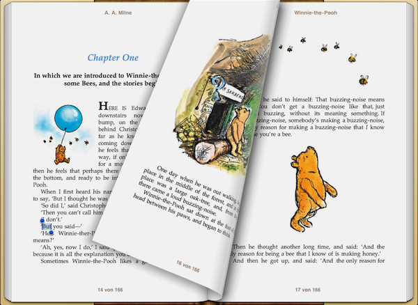
Note there’s a “stack” of paper on the left edge and right edge of the screen. This is to help us feel like it’s a “normal old book”. It’s supposed to assist with that normalcy field. However, it confuses the “knowing” the underlying structure because it never gets smaller or larger as you read through the book. If you’re on the first page, there’s a stack of pages of the left. If you’re on the last page, there’s still a stack of pages on the right. Users can literally push their finger onto the glass and move it to “turn” the page. The page turn animation assists with the “feel” by making it feel more real. However, once users are cranking quickly along in a book, the extra two seconds the animation takes gets in the way of the “doing”.
Think of other examples of skeuomorphism. How does it balance do, feel and know? Do you think visual metaphors like skeuomorphism are good or do you feel like we don’t need them anymore?
Project Two - Phase one: What’s the Big Idea?
Project Two is a website optimized for mobile devices. It will know where the user is and present information relevant to the user based on their location.
Machines knowing where we are? This is not normal. This makes people uncomfortable. Part of this project will be to figure out ways to help the user with this disruption in the “normalcy field” so they’re more comfortable and trusting of the site.
For this stage, use the techniques from last class to come up with a Big Idea for a mobile website that leverages the user’s location to deliver content about information in the Oxford area.
Now, you could do something “normal” like provide restaurant information, information about the campus, etc. However, I don’t want that. I want something that disrupts the “normalcy field”. For instance, what might a location-aware diary/journal look like?
Sketch wireframes (on paper is okay - but you will email me the wireframes) of your Big Idea. The wireframes should be of at least three pages (ideally more like five) and be fully realized. It should be clear how one navigates the site. Push the concept almost to the normalcy field breaking point. Wherever possible, you should use real images and sample text rather than filler text. I expect you to spend most of your time for this class this week on iterating and perfecting these wireframes.
Development
We’re really starting to have some powerful stuff now. However, how do you move it around? Now we’ll switch gears a little bit and do a brief overview of the process of getting your apps off of your computers and ready to load onto a server.
Assignment
- Project One (due 03-04-2015) - schedule a time with Kirk to demo your Project One (either in a Google Hangout or in person)
- Begin Project Two - Initial Concept/The Big Idea and wireframes