Week 5
11-17-2015
Goal: Use Responsive Design to Build a Web Page using CSS
- Practice with CSS - Create https://www.users.miamioh.edu/UniqueID/IMS222/ResponsivePage.htm
On Your Own 5
FixThisSite.htm (due 11-24-2015 by 5pm)
Find a website that fails and tell what needs to be redesigned to fix it. You should have one page identifying the site and it's problems and a sample page showing how you would fix those problems. Submit your assignment as a web page(s) to your UDS at https://www.users.miamioh.edu/UniqueID/IMS222/FixThisSite.htm.
I created a sample for this project that you can use as a reference.
Sigh of relief?
The remainder of this course will mostly consist of using the information that you have gained thus far.
The History of Interaction Design

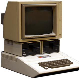
Let's turn to an expert. We haven't gotten into the history of interaction design all that much yet. But, Bruce "Tog" Tognazzini is one of the key early players in the evolution of interface design. In 1977, Apple introduced the first of the Apple II computers. The Apple II was a huge deal for a number of different reasons. Personal computers were just starting to emerge, but most were sold as components or in a kit that the end user had to literally assemble by hand. The Apple II was the first machine to be sold more like an appliance for regular home users to enjoy. It was almost an immediate success. By the end of the Apple II run, around 6 million Apple IIs had been sold, an unprecedented number of machines in the nascent personal computer industry.
Soon after the introduction of the Apple II, Steve Jobs saw some of Bruce Tognazzini work and had him hired onto the Apple II team. When Tognazzini began at Apple, it was commonplace for each application running on a machine to not only look completely different, but to have a completely different way of doing things as well. He was soon assigned to work on interface guidelines for the emerging Apple products. The first of seven editions of his tome The Apple Human Interface Guidelines was published in 1978. Around the same time, he worked on Apple Presents...Apple, a short tutorial that introduced users to the Apple II. He used his interface guidelines in that small bit of software as well as AppleWorks, a popular software suite. Because of the success of these two applications, developers for Apple quickly adopted his interface guidelines and used them in a large number of Apple II products. These guidelines would greatly influence the design of later Apple products including the Lisa (released in 1983) and Macintosh (released in 1984). We'll dive into the details later, but Steve Jobs was ran out of Apple and Tognazzini took over much of his work on the interface work on the Machintosh. At Apple, he developed a number of key interface elements we still use today: hierarchical menus, Application packages and drag-and-drop Application installation. After Apple, he went on to Sun and was one of the first technologists to predict the rise of the World Wide Web.
Out of these experiences, Tognazzini (also known as "Tog") has extracted sixteen guiding principles of interaction design. They're known as Tog's First Principles of Interaction Design and are widely regarded as key foundational principles for successful interaction design. Once you understand these principles, you'll be able to apply them in creation of your own interaction design as well as critique of failed interaction design.
Critiquing
Anticipation - from Artie Kuhn
"Applications should attempt to anticipate the user’s wants and needs. Do not expect users to search for, or gather information, or evoke necessary tools. Bring to the user all the information and tools needed for each step of the process."
It is key to understand your user and anticipate what they need to get done at that moment. This anticipation can either be implicit (automatically reveal tools when the user is doing something), explicit (reveal tools when the user asks for them) or invisible (simply do something when a user does something else).
Explicit anticipation is relatively easy to understand, show a set of tools when a user asks for them (like showing "Undo", "Copy", "Paste", etc. when the user hits "Edit").
On iOS (the operating system that powers the iPhone and iPad), autocorrect runs constantly and automatically invisibly corrects user mistakes. If a user had to invoke an autocorrect "command" every time he or she wanted to check what they just typed, it would almost never be used. While autocorrect makes a mistake here and there, on a whole, it makes using the device much easier.
In my opinion, implicit anticipation is when things get really exciting. When I was at Cengage, I worked on a number of ebook platforms. After analyzing usage patterns, we found that most students and instructors never used our highlighting features. This seemed like a shock because all of the ethnographic research I had done showed that students highlighted their physical book like there was no tomorrow. On the primary ebook platforms the company produced, all highlights were generated by either clicking a button next to the paragraph to highlight the entire paragraph or by jumping through a series of steps to create a highlight. I realized that, instead, we could anticipate when the user would want to make a highlight and only present that option at that moment. Inspired by radial menus that were used in games at the time, I created the concept of waiting until the user selected a passage of text with their mouse and then displaying a small highlighting button near the mouse:
Aplia Text Highlight 01
Aplia Text Highlight 02
Clicking the small icon would save the selected text as a highlight. Removing a highlight would be just as anticipated. A small "x" would appear on the highlight only as the user rolled his or her mouse over the highlighted passage.
Clicking this small "x" would remove the highlight from the student's text. After we launched this feature, usage patterns of highlights went up through the roof. Rather than around 1% of all users making a single highlight, every user (on average) made nearly 40 different highlights in a given book. User research and surveys showed that this one small feature improvement was one of the highest rated features of the entire product. And in the highest form of flattery, this implicit anticipation model of using a user's selected text was quickly "repurposed" in a number of competing ebook platforms. Improvements like this rarely occur in a vacuum and often times many designers come up with the same solution to a problem at the same time. In this vein, about eight months after we launched this feature, a similar one was launched as part of iOS's copy/paste system.
On the surface, the Windows 8 Explorer seems to do well with Anticipation. After all, nearly every command imaginable is available all the time to the user up in the ribbon at the top of the window. However, there are two problems with this once one digs deeper. First, beyond a number of options, users get lost in a paradox of choice, never quite sure which button they really should press. The second is that there's no real anticipation here. Anticipating every need imaginable certainly isn't real anticipation. Instead, the designers should have tucked less common features away and only presented the more common ones. Their own usage statistics in a blog post show that a very small number of tools are used the vast majority of the time. As such, they should have made those features front and center and tucked the remaining fringe cases away. Instead, tools are organized by function ("share", "view", etc.) rather than by anticipating common usage.
Windows 8 Explorer
Autonomy
"The computer, the interface, and the task environment all 'belong' to the user, but user-autonomy doesn’t mean we abandon rules."
Imagine if your email application didn't report how many messages were unread and forced you to read each one at a time like an answering machine. It would be maddening. However, that's exactly what many novice interaction designers do, especially ones moving from print. Rather than force some sequences to be linear in nature (like a book), a key component of interface design is giving users the tools and autonomy to move through content how they see fit.
Sometimes, users need rails. Protection from their own stupidity. A great example of this is systems that force passwords to be a certain "strength". However, rather than forcing the user to attempt one password and fail if it isn't "strong" enough, systems that respond as the user is typing in a prospective password are the best.
Windows 8 Explorer makes no assumptions that users can...well...learn and that they deserve autonomy. Instead, all options are displayed all at once rather than tucking them away for progressive disclosure as the user interacts with them.
Color Blindness
"Any time you use color to convey information in the interface, you should also use clear, secondary cues to convey the information to those who won't be experiencing any color coding today."
Color blindness is a real thing that you should keep in mind. Often times it's helpful to have visual elements beyond just color indicate something. So, for instance, if it's imperative that a user sees the difference between two lines on a graph, simply coloring one red and the other green is a problem. Instead, make the red one a solid line and the green a dotted. This way the lines differ graphically beyond just by color. However, this is no excuse to expose the user to a deluge of superfluous visual noise. Instead, keep a tight reign and keep things as Edward Tufte says "the nearest perceivable difference".
One of my favorite apps that I use to double check against color blindness issues is Sim Daltonism. When running it, it previews how something will look to different folks dealing with a variety of color blindness issues. I'd recommend picking up asap.
In this principle, the Windows 8 Explorer fares better than the others. However, contrasting the garish colors in the Windows 8 Explorer with the subtle grays in Mac OSX Lion's Finder, and one sees that the broad color palette Microsoft is employing really isn't necessary at all to communicate.
Check out the screen shot of Mac OX Lion's Finder (developed at the same time as the Windows 8 initial blog post).
Mac OS X Finder
Consistency
"The following principles, taken together, offer the interaction designer tremendous latitude in the evolution of a product without seriously disrupting those areas of consistency most important to the user."
Have you ever gone to a website and started typing a search phrase into a text box in the upper right or top center of the page only to discover it isn't a search box at all?
Ever had an application like Office for Mac that used shortcut keys different than every other Mac app?
This sort of thing will drive your users insane. It's taken Adobe years to get their apps consistent. It was a rough patch there at the beginning. The consistency was just a surface/veneer consistency. Tool icons were the same across apps like Photoshop or Illustrator, but the tools themselves behaved completely different. The classic example is the small box on top of another box at the bottom of the toolbar in Photoshop and Illustrator. In Photoshop, this is the background and foreground colors. In Illustrator, it's the stroke and fill. They are visually consistent, but functionally inconsistent. This isn't good.
In the Windows 8 Explorer, we find very little visual consistency. Buttons are all different sizes, arrows mean different things (a down arrow on an icon means something completely different than the right arrow in the folder path or the up arrow next to the folder path or even the up/down arrows near the scrollbar). Button style is inconsistent (the back/forward arrows near the folder path look like cast offs from the Mac's Aqua interface while the icons in the ribbon at the top barely look like depressible buttons at all). The icon in the upper right of a Word file with the word "Open" next to it clearly changes depending upon which file type is chosen below. While this is a nice bit of anticipation, it also introduces inconsistency into the user interface. I'm sure any one of you can find another five or ten inconsistent visual elements in the design. From a user experience perspective, there's a tremendous amount of redundancy (and, thus, inconsistency) in how one does something. For instance, to create a new folder, one could choose the tiny icon in the upper left, or the giant new folder button in the middle or right-click in the file list space. Opening files is even worse. One could double-click an item or single click it, then laboriously move their mouse button up to the "Open" button. Finally, the "ribbon" model itself where icons are tucked away under different tabs ("file", "home", "share", etc.) means that buttons that trigger key functionality (like opening a file) are sometimes tucked away and require even more clicking.
Defaults
Defaults should be easy to 'blow away:' Fields containing defaults should come up selected, so users can replace the default contents with new material quickly and easily.
Defaults should be "intelligent" and responsive.
Defaults determine behavior. However you want your users to use your product, set the defaults that way. When I was at Aplia, we discovered that students weren't reading explanations for why they missed problems. So, we introduced randomization and the ability to try a different randomized version of the same problem three times. By changing this default, we saw a tremendous increase in students reading (and learning from) explanations.
While we don't know anything about the Windows 8 Explorer defaults, we can assume that there will be an inordinate number of options for customization and tweaking the interface. Which would you, as a designer, prefer: people actually use your product to get stuff done or people noodle around in endless tweaking of settings?
I've just gone through how the Windows 8 interface fails along a few examples. Reply to this post in how it fails in one other aspects of Tog's First Principles.
Magic Ink
Supersize that background please
CSS Gradations
Fonts on the Web
Next, you're probably a little bummed by web safe fonts. They're so limiting. Thankfully there are services that have come out that leverage new items in CSS to enable you to have more options. The two dominant players in this space are TypeKit and Google Fonts. TypeKit is a paid service (with a small free demo version), but with great fonts. Google's solution is free, but with cruddier fonts. Here's an introduction to both:
Javascript
JavaScript is a way to make things go. If HTML is what it is, CSS is what it should look like, JavaScript is what makes the interface do it's thing. Check out these resources to get comfortable with javascript.
Using JavaScript for photo slideshows
Using jQuery for parallax scrolling backgrounds (the backgrounds scroll at different rates than the foreground to simulate depth)
Using jQuery to make a page smooth scroll between different spots vertically
Final Project
FinalProject/index.htm (due 12-03-2015 by 5pm)
Submit your final project by uploading it to https://www.users.miamioh.edu/UniqueID/IMS222/FinalProject/
More info from Artie
By this point, it should be obvious that everyone needs a presence on the web. It's a non-negotiable element in today's world. That presence needs to be beyond Twitter and LinkedIn for when you get jobs, pursue graduate work, etc. This Project is designed to help you build that web presence.
I'll address some specific concerns students often have about this assignment. First, if you're not in a major that relies on visual elements to get a job (aka a portfolio), you still have assets that you can write about and promote. For instance, last semester I had a Math major and a Sports Management major. At first, both said they didn't have assets to promote. However, after prodding, it became clear that the Math major had certain projects, proofs, algorithms, etc. that were pretty special that he had put together that would make great case studies to show how he works and what makes him awesome. For the Sports Management major, she had examples from her leadership skills when doing internships and other case studies she could put together as well. All of you have (or at least should have!) examples of your undergraduate work that prove you're capable for whatever your next step is (no matter if your next step is an internship, full time employment after graduation, freelance work, applying to graduate schools, whatever). That proof is what you should write about and highlight in project three.
Another aspect of project three is the importance of story telling. We looked at this concept previously in the lectures, but telling a story about each of your projects is key. When I hired people, I was not at all interested in the final output in their portfolio. I was interested in their process for how they arrived at that final output. That process needs to be told as a story. It is a requirement for this assignment that you not only highlight the project, but that you write at least three paragraphs for each piece. I would recommend using the story telling techniques from the lecture: form it as a three act play. First act is the problem you had to solve. Second act is the process you went through to solve it. Third act is the results of your solving the problem. So, if you want to write about your recipe websites, the first act would be the research initiative, second would be wireframes/mockups/proof-of-concept built, third act would be feedback you received. As students, that third act will be the hardest to obtain. Once you are working out in the "real world" that third act will be things like number of users, results of surveys of how popular the thing is, how many sales the thing had, feedback from customers, etc.
Personas for your final project
Your personas are fairly straight forward. These have been constructed based on years in industry working at design firms, advertising agencies, publishing groups and leading software development teams. For the academic personas, these are developed by observing peers at two different universities.
Note, not all of these personas will apply to what you want to do next. Select a persona as your primary persona given what you want to do next.
Caring Chris
Chris works for a large corporation, but he really cares about his customers and does not care about the politics of working within a large corporation. As such, he's assembled multiple small teams and has created innovative solutions his entire career. This has impressed his supervisors, but makes him a bit of an outcast among other mid-level managers. Chris' team is swamped. He wants to push them to be able to do new things, but they're busy maintaining the status quo. He needs new blood to be added to his team.
- Problems-to-solve
- Chris is busy, so he will review a website, but will only drill down deep into a few projects
- Chris knows about what it is you would do in the position, so he wants to see your specific skills
- He has a specific vision for the type of culture he wants to cultivate on his team, so knowing what you're like is important to him even before he makes time for an interview
Human Resources Harriet
Harriet has been in human resources for 20 years at a mid-sized corporate environment. Harriet will take requests for new jobs, determine their viability given resources and will approve looking for a new position. Once hiring managers have that approval, they submit to her a detailed job description including terms and buzz words they're looking for. Harriet is removed from the job, so she does not understand what this person will really be doing day-to-day and doesn't understand the terms and buzz words she's told to look for. Once a job description is approved, she will submit this through various job websites and head hunters and will narrow down the initial list of applicants to hand off to the hiring manager. She is extremely efficient at what she does.
- Problems-to-solve
- Harriet does not know your world, she simply knows to look for buzz words (like "Social Media Expert"), so be sure to write your content with her in mind, especially your entry point (homepage).
- Harriet does not know your world well enough to judge the projects, so your third act will be extremely important to her.
On His Own Owen
Owen started the firm you're applying for twenty years ago. He's had a few partners, but they've all retired. He's proud to have grown the company into a mid-sized firm and is still engaged in hiring folks. He is like Harriet in that he doesn't know exactly what it is you'll do (he trusts his hiring managers like Chris to handle that), but he's the first pass on all applicants.
- Problems-to-solve
- Like Chris, he's busy, so he will only look at a few items
- He is like Harriet in that he doesn't know what it is you do, so he'll look for buzz words and the third act
- The corporate culture he's building is extremely important to him, so getting to know who you are outside of your work is important
Academic Angie
Angie reviews applicants to the graduate program you're applying for. She is swamped. She knows her program extremely well and knows the type of student who does well.
- Problems-to-Solve
- Angie is busy, so she'll only review a few items, but she'll know which items are most important to her
- Personality fit is extremely important to her. While she likes to bring in students who have differing personalities, she does want someone who will play well with others
- She'll likely forward links to your specific pages to some of her colleagues for feedback
Small Business Sam
Sam is running his small business. He's looking to hiring a freelance/contract person with your skill set. He's busy, but his business is his baby and is willing to invest many hours in finding just the right person. However, he's not exactly sure where to find you.
- Problems-to-Solve
- He doesn't really understand what it is you do, so he's primarily looking at your third act and seeing if he simply likes your work (your process is slightly less important)
- He wants to make sure you'll be easy to work with